I teach a course at CUNY Baruch on the structure of U.S. higher education, and a large part of what I try to do in that class is to encourage students to be able to segment higher education in various ways: How are research universities different from small liberal arts colleges? How are public institutions different from private, not-for-profit institutions?
One of the tools I use to help them do this is a Google Fusion map:

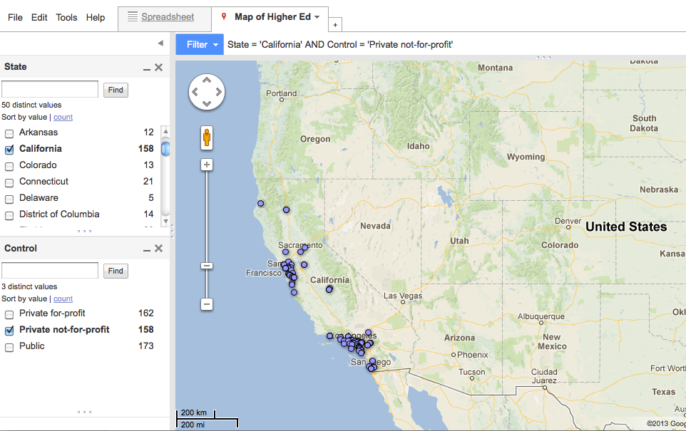
In the screen shot above, all institutions in the continental states and D.C. are shown (with the exception of Hillsdale College). Red dots are two-year institutions; blue dots are four-year institutions. Even in this view we can notice at least one pattern: Heavily populated areas have more institutions than more sparsely populated areas.
By clicking on "filter," users can view a subset of institutions, such as HBCUs, colleges with enrollment of 1,000-1,500 full-time students, or private colleges in California.
The map was created in Google Fusion using IPEDS data. I chose Google Fusion because I have no experience with GIS and it is free. However, it has some serious drawbacks that make it much less user-friendly than I would like; ultimately, this means my students don't take full advantage of it.
Fusion is often non-intuitive (for example, figuring out how to upload a CSV file and convince Google to use it as a Fusion table rather than placing it in your Drive) and has surprising limitations (a column can't be deleted if the table is the result of merged tables). That is less problematic than the difficulties it presents to the end users.
One challenge is that that what users see is exactly what the table editors see. I can't hide the spreadsheet from them, for example. Students have a fair amount of difficulty learning to operate the filters; there are too many irrelevant menus (e.g., File, Edit, Tools). They don't need to know how the sausage is made - they just need a sausage and a fork.
The larger problem is that the presentation of data is surprisingly limited. My biggest wish is for students to show different types of institutions in different colors. It would be very instructive, for example, to show all private and public institutions in different colors, and then turn that option off when you are examining something else. However, Fusion doesn't allow icons to change on the fly, so I settled on two-versus-four years as the default. But it makes it much harder to visually see the proportion of privates versus publics if one has to toggle back and forth between the two, or (worse) mouse over every individual institution.
Ultimately, the map is not entirely successful as a pedagogical tool. For a savvy user, it could be useful for the creation of graphics. Fusion seems to be a case study in forgetting who the most audience is for a software product - it should not be for the developers, but the users of what the developers produce.
Have you looked at all into Tableau Public? Nicer interface, free and very good with GIS-type data.
ReplyDeleteHm, I have not. Thanks!
ReplyDeleteOr, maybe I won't. Not a Mac product!
ReplyDeleteIsn't this map available now? Would be great, as I was searching for such map, not much success for now.
ReplyDelete